Final Analysis
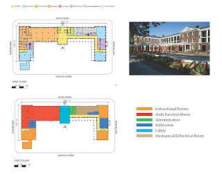
The one thing I'd noticed about this building was that it has many day care, classroom and community room and spaces. I believe the architects main focus was to provide housing and services for the families in the community and also offer educational enrichment and activities in the area.
SOS Children Villages Lavezzorio Community Center
This building design i felt was pretty simple and straight foward with simple geometry and circulation.I believe the architects intent was to create a multipurpose that is capable of hosting a lot of events and bringing the community together. The geometry of this building are simple rectangles and square with flexible spaces utilization for hosting any events.
Case Community Center
This building has a very typical design to a court and features architecture style like the Ancient Greek temple, with the main entrance and two axis on the end. This building is very unique and symmetrical. I felt this building has a geometry of the letter "C" and it is surrounded by water, which allows students to experience the New York maritime lifestyle.
New York Harbor
School/Center
This community center building has a very simple but complex rectangular geometry. In my analysis of this building i think the architects idea was simply incorporating two simple geometries to make a center that would govern children and bring families together in the community. Circulation in this building is very elaborate, starting on end of the building and exiting at the other with all the private space in the center. Natural light mainly penetrates the south side of the building, where the lobby is and most of the public spaces.
El Rio Vista Recreation Center / Wellstone
Community Center

This building is museum that located next to sea, with simple rectangular and square exhibition spaces and galleries. This museum is a maritime museum which is very influential to the building type that i will be studying and designing. It is next to the water and it exhibits the marine life and geographical history of Cyprus, Greece. This museum offers a great deal of exhibits, which makes the spaces more than less public and easy circulation through the building.
Thalassa Museum (Municipal Cultural Center)

This building has a natural and organic shape. On analyzing the structure i felt it looks like a bulge in earth surface and forms a community center for the people in the area. The Architect approach in the design was based on the form of the waves, which helps to form the building and the outdoor recreational park. The end result was a public landscape of social function surrounded by water on all sides. In further analysis i researched and realized that the building has an indoor space, which is separate use for the water sports team and the landscape for the community.
Maritime Youth House/ Plot

This building stands as one of my favorite building i analyzed.. Its has a very organic shape and a colorful design material plated canopies sustained by concrete columns. The circulation of this building is simple but yet complex. The architect made a large gather/lobby space in the center and all of the exhibits and gallery spaces are stretch out on the wings of the building. I believe the architect departed from his usual metallic color scheme and added multicolor panels that reflects the tropical environment. The big idea behind this building was to create an organic structure that features the work, art and tradition of Panama city.
Frank Gehry's Biomuseo

In the analysis of this building i found out that they was a bridge that connects to the building and draws the visitors away from the busy roadway and into an enclosed experimental environment. The building is interconnected by trapezoid blocks which compose the overall structure, scaled and oriented in response to the built surroundings. The building is very huge in mass and made of sculpture forms, with irregular windows penetrating the structure. The galleries of the museum is formed by the conglomeration of the different size trapezoidal blocks surrounded by the natural environment and water.
The Hepworth Wakefield center

This building was created by basically pulling together of spaces that creates a linear path and main patio space, which i think is the most important space in the building. The main elements of the building is organized on two levels surrounded by a lined patio, bringing light and pulling together the heart of the building. The big idea of the design was based on the generosity and density for the area and users in the community. The design allow the public to interact with the private spaces simultaneously. I think the architect idea behind the outdoor space, was created as an extension of the public space enhancing the identity and image of the neighborhood.
Cultural and community Center

In my analysis of this building i think the main idea was based on the bottom of a boat. The architect incorporated the idea of the ship as the main structure member that holds the building together and also for aesthetic purposes. The structure of the museum is housed in a steel and glass ship hull which allows for natural light to penetrate thru the glass sides of the building. The museum seems to create a sense of exploration and interactive exhibits that showcases Singapore's history and art.
The Maritime Experimental
Museum


